Accelerate your understanding with Apteco Orbit Venn
Venn diagrams are a new addition to the extensive kitbag of dashboarding and customer data analysis functionality in the Apteco Orbit platform. Venn diagrams are a critical tool in your analytics arsenal and are used to compare and contrast groups of data depicted in sets. And they’re a highly effective communication tool to illustrate that comparison.
Venns are also often used to predict the likelihood of certain occurrences, which ties into Predictive analytics. In just a few clicks Orbit Venn can identify, visualise and action data thoughts across your entire dataset.
Need help? For a practical, step-by-step guide on how to use Venn diagrams in the Apteco Orbit platform, visit the Apteco Help Hub.

Find the answers with Apteco Orbit Venn
There are a few core data questions that marketers need to answer in order to understand their customer's needs. Most of these questions revolve around knowing who, where and what customers are doing, and how they are transacting. Now you can use Venn diagrams in Apteco Orbit to find the answers.
Turn insight into action
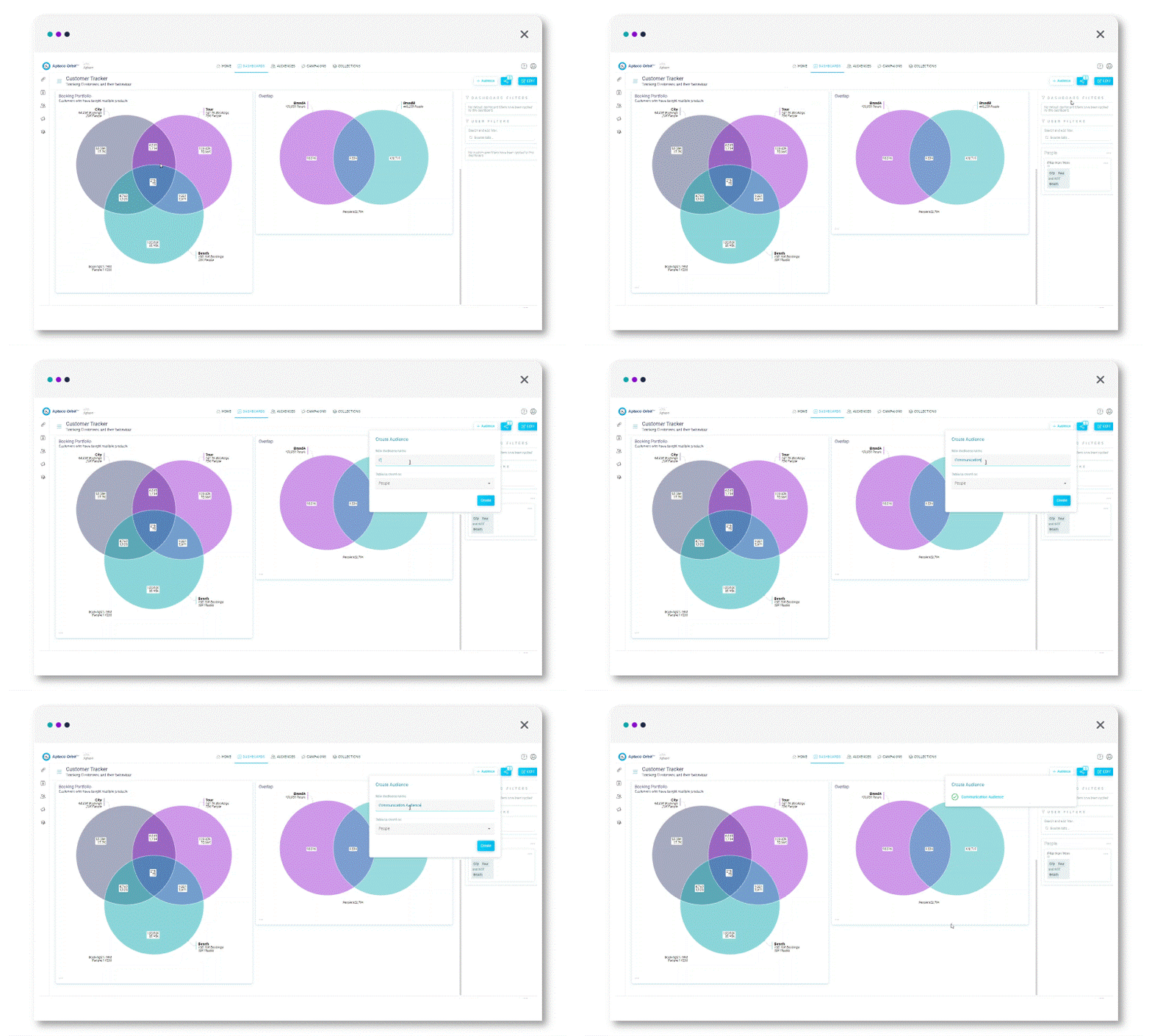
Simply select the overlapping or non-overlapping segments and automatically create audiences from them for further analysis, to export or to use in your Orbit campaigns.
Connect your data for smarter decision making
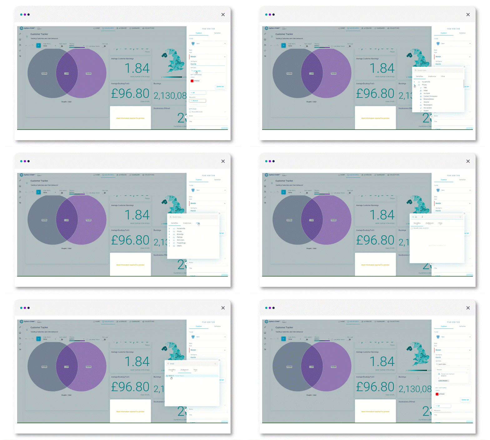
Easily construct a Venn diagram within the Apteco dashboard by selecting data from an existing target audience, URN file or through a simple set of queries on the fly. 
Drill-down to explore data selections further
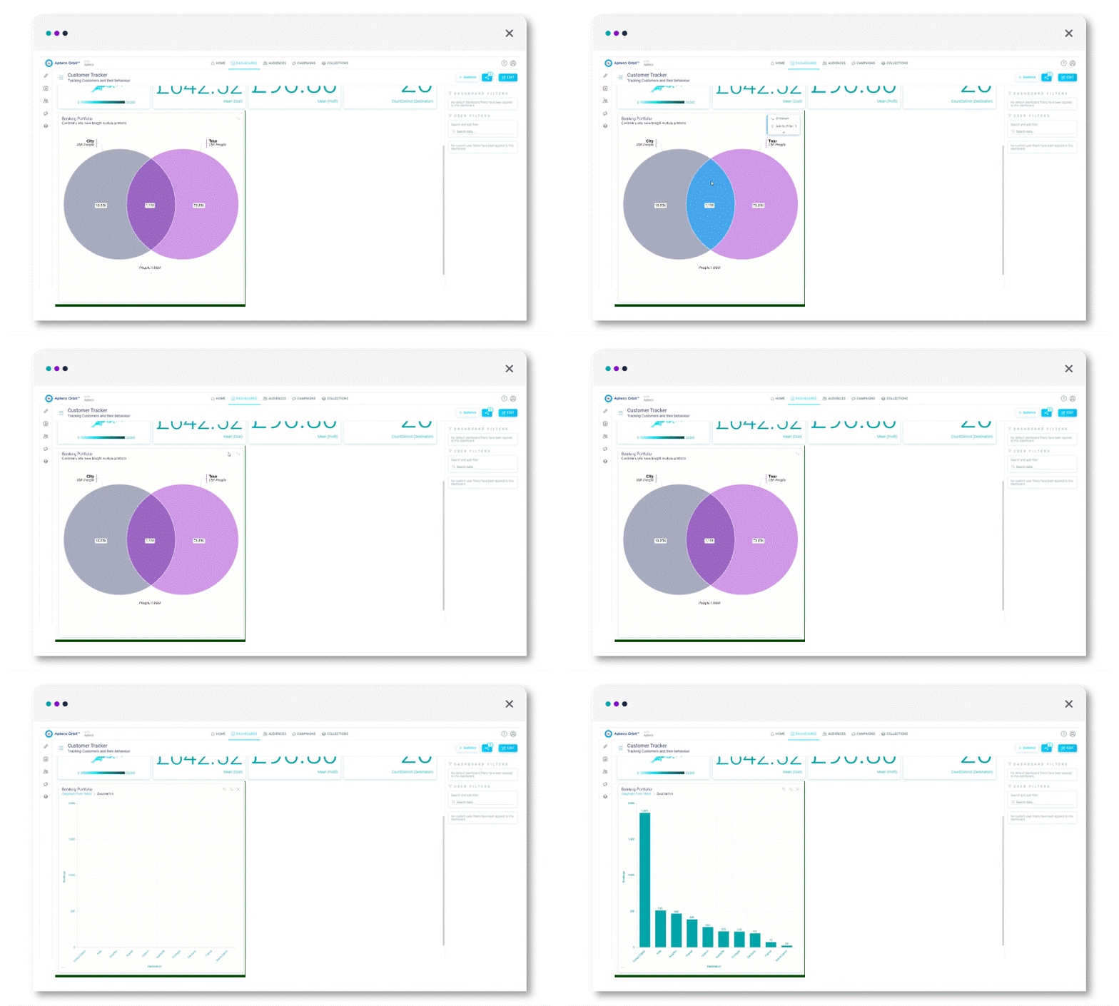
Using the drill-down functionality you can select any segment of people that interest you and then drill-down to discover even more insights about them.

Clever zoom functionality
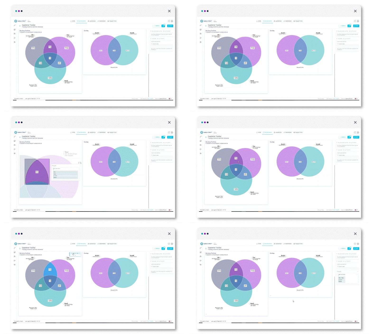
Interact with your visualisation, by clicking on any segment or intersection and utilise the zoom functionality to get a better understanding of the data within that section.

