:format(webp))
The Apteco Datathon: 1. Analytics on flight delays
In our new Apteco Datathon series, our data experts deep dive into real-life datasets to analyse and interpret the numbers. In this first case study, we look at data from the UK Civil Aviation Authority around flight delays.
Introduction
The UK Civil Aviation Authority (CAA) (1) produces detailed monthly statistics on a number of topics related to UK airports. In this case study we’ll be using FastStats to analyse how delays to flights in the UK have changed over the past 20 years. We’ll show some interesting trends relating to the number of flights and how this changes throughout the years, and also how this relates to average delays based on a range of factors – such as by airport, flight type, and flight distance.
Data Collection
The hardest part of many data analytics projects is obtaining the raw data and wrangling it into a suitable format for analysis. As of March 2018, the CAA has the data from 1995 to the end of 2017 available on their website in a set of monthly CSV files (2). Each CSV file is an aggregated monthly view of a particular flight route (e.g. Birmingham-Copenhagen for airline X in the month of January 1995). Each data row contains details on:
- The origin and destination airports
- The airline name and a chartered/scheduled type
- The number of flights on the route
- The average delay (in minutes)
- The percentage of flights that fit into a set of different lateness bins
We’ve structured our data around the ‘Reporting Airport’ (the UK airport reporting the data). We’ve then extracted flight delay data and linked in airport passenger data for some of those years (although this has not been used in the analysis below).
This data has been combined to create a FastStats system. Comprising roughly 1.4 million rows of data representing over 31 million flights originating in the UK over the last 22 years, it’s not a large dataset. The data model isn’t particularly complicated – there are less than 30 variables, primarily selectors and numerics, with a date field representing the reporting month. However, there were a few issues in the data preparation phase which needed to be addressed:
- Average minutes delay was allowed to be negative before the year 2000, and then the reporting was changed so this was set to 0 if there was a negative delay.
- For many (but not all) intra-UK flight routes (e.g Aberdeen-Birmingham) the data was being duplicated for both airports, so we’ve flagged the data where this has occurred. This allows us to undertake analysis on flight routes and numbers by ignoring duplicates, and also analyse delays at each airport by factoring in the duplicate data.
- We’ve enriched the data by computing latitude and longitude data for virtually all of the 1,260 airports that are referenced within the dataset. This enables analysis to be undertaken by location, by distance, or for the creation of maps for analytical purposes.
Basic Trends
The data has been provided as a set of monthly aggregated files so we can’t use any date bandings more granular than months. Firstly, let’s look at the number of flight routes across each month of the year.
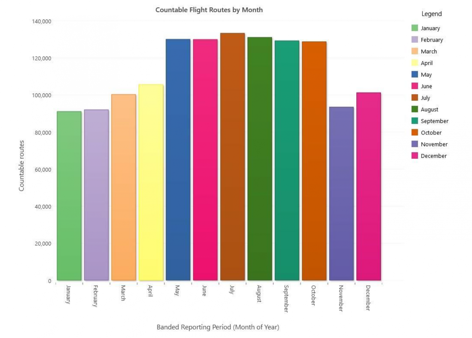
It’s not much of a surprise here to note that there’s a strong seasonal pattern. The more popular summer months have more charter flights and therefore more flight routes than the winter months. December has a slightly higher number of routes, probably because of the Christmas holiday seasonal flights.
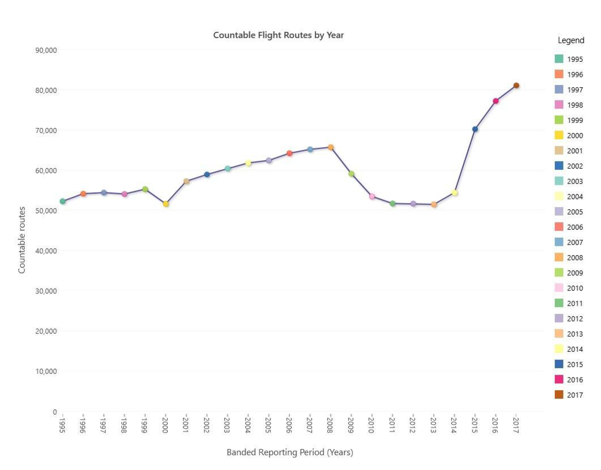
Let’s look now at how the numbers of routes per year have been changing by altering the dimension to a Year banding.
There are a number of interesting things in this chart. There appears to be a general upward trend from 1995-2008 apart from a downturn in the year 2000 (more on this in a bit). Secondly, there’s a significant downward drop between 2008 and 2014. A likely reason for this could be to do with the general financial situation in the UK at that time. Then since 2015 there’s been a marked recovery in the number of flight routes available, with 2017 having the highest number of routes in any year so far – although the pace of increase looks to be slowing.
A final chart in this series is to look at a monthly view. We’d expect to see strong seasonality across each year, and the overall trends to be in line with the year view above (slowly up, drop off, then sharp increase).
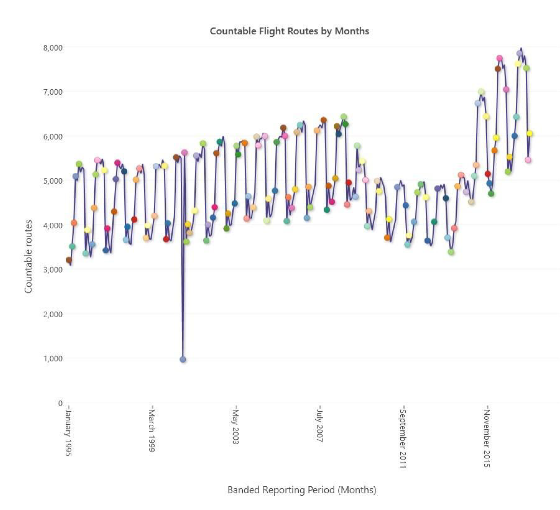
This is indeed the case, except for one extremely obvious anomaly. The month of September 2000 (one year before the 9/11 attacks) has about 1,000 routes, when we’d have expected around 5,000. This accounts for the dip in the yearly view seen on the previous chart. Investigating this further we went back to the source data provided and the file contained this number of records. With no discernible reasons to account for such a low number it’s likely to indicate an error in the source data provided.
If we agree with the hypothesis that the downturn between 2009 and 2014 was caused by the financial crisis in the UK at the time, then repeating this analysis in a few years will see what effects the currently uncertain political climate has on the aviation industry in the near future.
We could spend plenty more time in looking at how these flights breakdown by Scheduled/Charter flights, how this changes over the seasons and how it has changed over time. We could also look at flights by particular airlines or to particular destinations and see the patterns of how these change over time.
Flight Delays
Looking at general trends is interesting, but this gives just a shape of some of the volumes and how they’re changing over time. The main reason for this data set to be made available is to enable reporting on flight delay information across UK airports.
The data has a record for average delay in minutes for each flight route for the month. This level of aggregation is too much to be able to identify very short-term effects on flight delays (e.g. one-day strikes or short-lived weather events such as a storm passing through), but it should be sufficient to see events that had a bigger impact and to identify any long term trends.
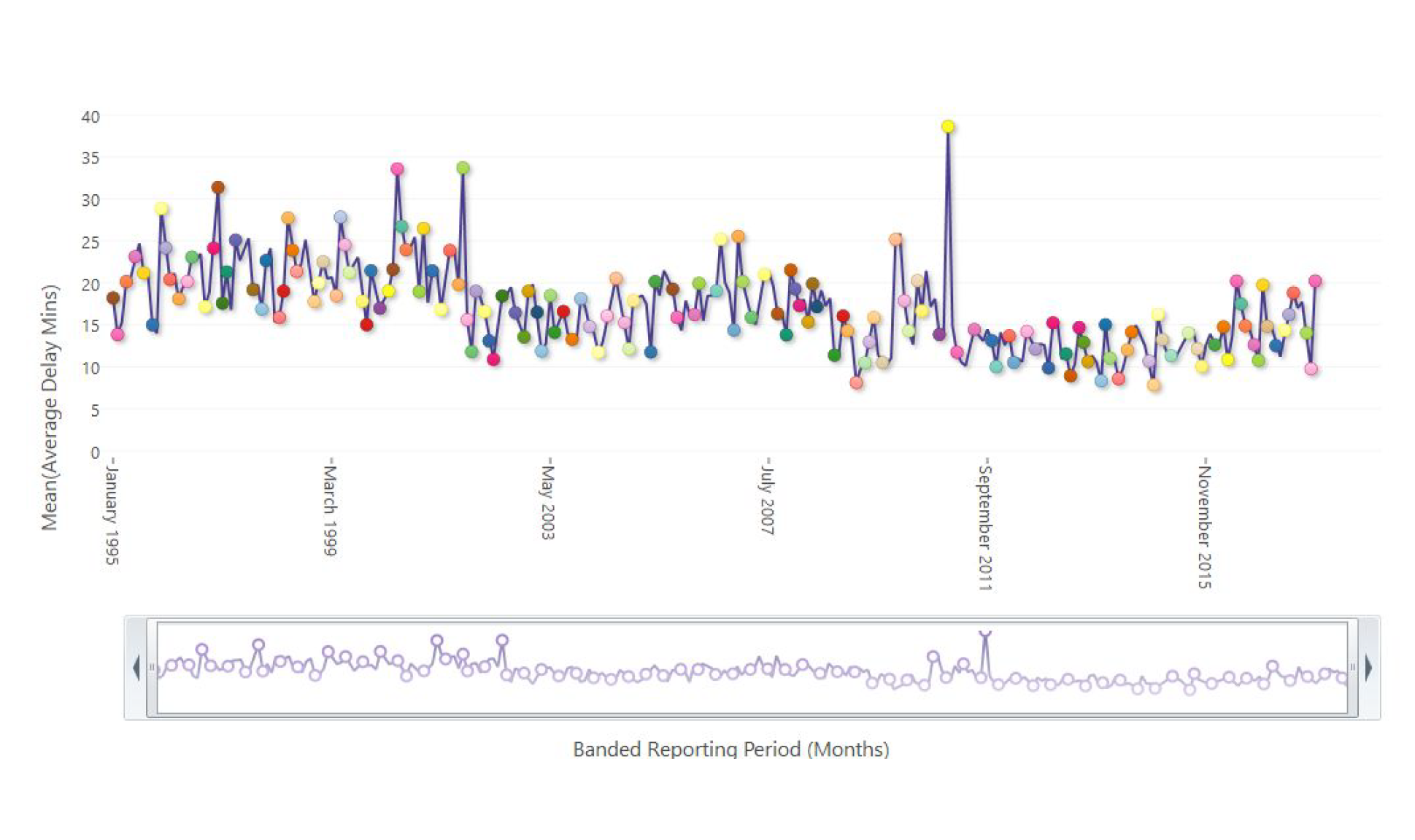
We can start by looking at the average delay across all routes for monthly/yearly and month of year bandings. This first yearly chart shows a general long-term downward trend in the average flight delay with an interesting spike in 2010 that disturbs this pattern.
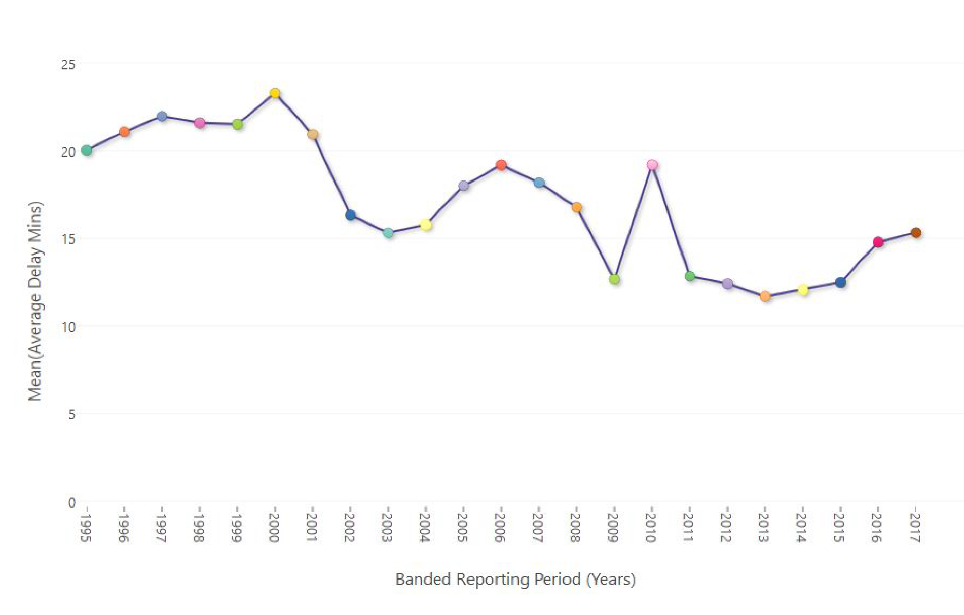
If we drill into this and go down to a monthly view we can see why there was a spike in 2010. The highest value (yellow circle) of 38.64 minutes average delay across all flights occurred in December 2010. From personal memory (with a 1 month old baby!) I remember very clearly the copious amounts of snow and very low temperatures that month. This is quite likely to be the reason for this anomaly. The next highest value – 33.70 minutes in September 2001 – is almost certainly down to the heightened security measures in place and delays caused by the 9/11 attacks.
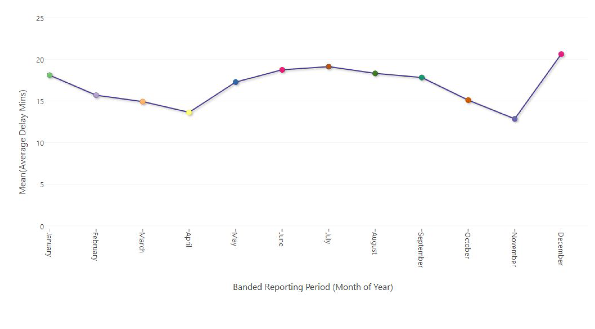
Finally, let’s look at a banding by the Month of Year. Not surprisingly (based on the previous two results), December is the month with the highest average delay. Following that, the summer months (in which there are more flights) have higher delays then spring and autumn.
We now have an idea of the overall delay picture, but how is this affected when we start breaking this down by other variables available within our system?
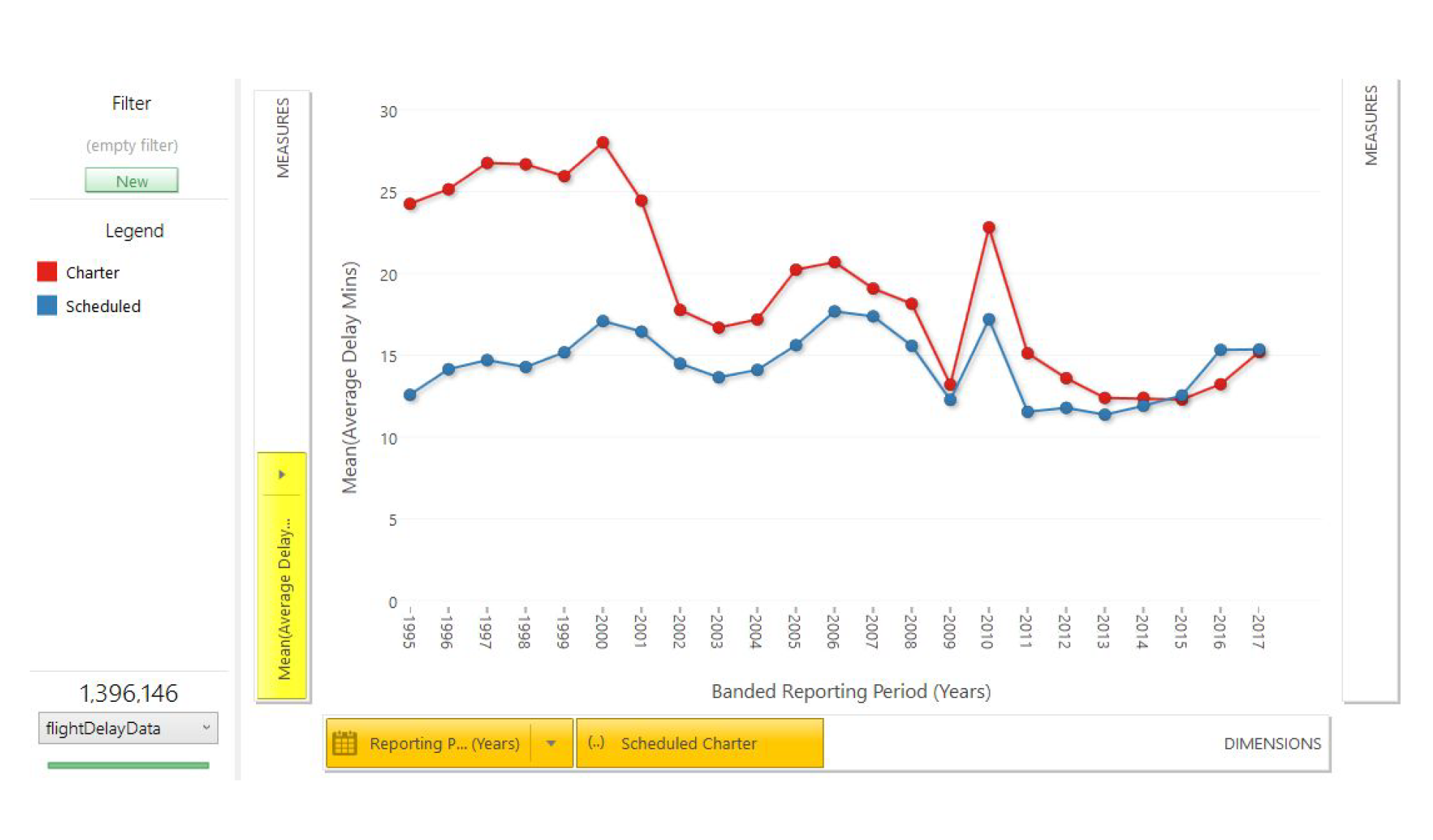
Let’s look firstly at the differences between Charter and Scheduled flights. There certainly was a much higher average delay for charter flights many years ago, but that disparity has disappeared in more recent years. We may have expected to see charter flights with higher delays as the same planes often have quick turnarounds, and any delay on an outbound flight will have a knock-on effect to the subsequent inbound one.
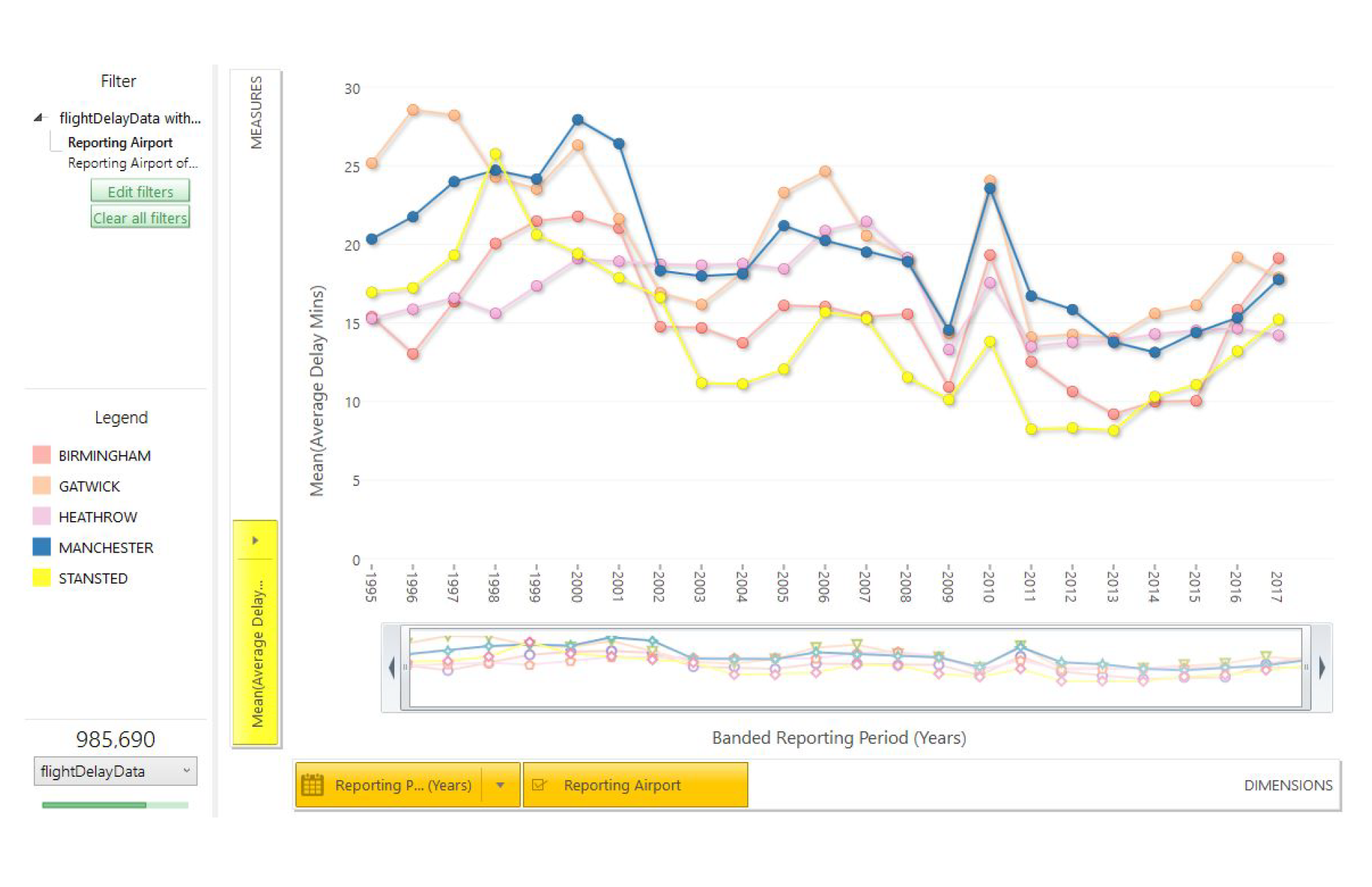
Now, let’s look at the average delay broken down by reporting airport. To make the chart clearer I’ve chosen to focus on the five biggest airports in the data set (by both number of routes and number of flights). There are no big differences between the airports, but Gatwick is nearer the top and Stansted has generally had the least delays in most of the years.
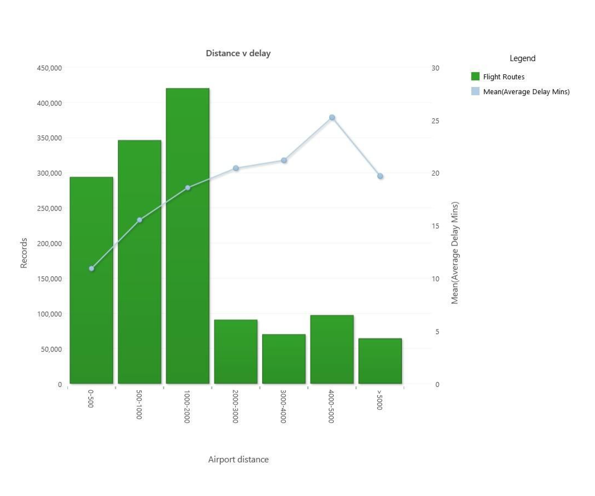
Finally, I’ve decided to look at whether the overall distance of a flight has an impact on the average delay. We’ve used the powerful geographic expression capabilities provided by the GeoDist() set of functions to calculate the distance between the origin and destination airports for each flight route. For the example below we’ve then banded these flight distances and produced a chart that shows both the number of routes in each category and the average delay. This shows that there is indeed a positive correlation between flight distance and overall delay (at least up to 5,000 miles).
Profiling
I’m going to look at one final piece of analysis in this blog. I’m going to use the Profile tool to explore which factors are responsible for routes having an average delay of more than 30 minutes. The analysis I’ve conducted above has led me to think that 30 minutes is a reasonable indicator of flights being substantially later than normal. This figure corresponds to about 15% of the flights.
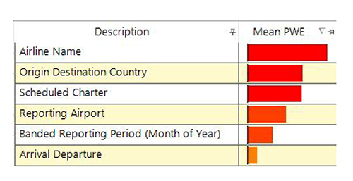
I’ve chosen to include a number of factors in my model (Destination Country, Scheduled/Charter, Reporting Airport, Month Of Year, Airline Name, Arrival/Departure). The analysis will consider these independently and indicate which variables are most indicative, and also which values are likely to indicate a route had high delays.
A couple of screenshots of the profile results are shown below. Firstly, when looking at the overall variable level, the Airline Name is the most important factor and the arrival/departure flag is the least important.
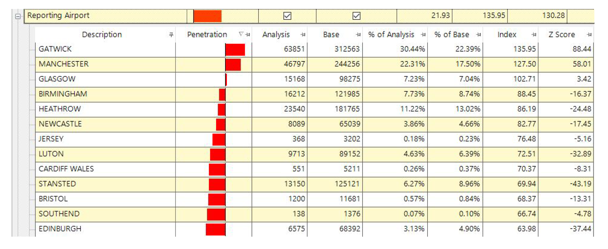
I’ve now expanded the details for the Reporting Airport and sorted by the Penetration column. This bar indicates the importance of the factor (to the right means more likely, and red means it has a statistically significant Z-score). This shows that Gatwick and Manchester have a higher likelihood for flights to be late than we should expect.
Looking into the other factors we could then get a feel for the overall nature of which flights are more likely to be on time or to be late. What can we conclude from this? Firstly, if you’re planning to fly with Lufthansa or KLM from London City airport in November then you’d better get to the airport on time. Conversely. if you’re planning to fly with Ghana Airways in December then a good book to read in the airport might be needed!
Conclusion
This is a rich dataset despite the relatively small number of variables that are provided. In the analyses shown here only a very small subset of the questions that could have been investigated have been looked at, but this has already yielded some rich insights into the changing patterns in air travel delays in the UK in the 21st century.
Notes
(1) The dataset described in this blog post has been collected from the Civil Aviation Authority (CAA) website. The URL is: https://www.caa.co.uk/Data-and-analysis/UK-aviation-market/Flight-punctuality.
(2) Data is available between 1990-1995 as well but we have chosen to just focus on the 1995-today period.
See how marketers are using data to get rich insights by downloading the Customer Centric Data Trends 2018.