:format(webp))
Apteco Q2 2022 software release now available
Posted: 22 June 2022
Explore the highlights from Apteco's Q2 2022 software release
Apteco is constantly investing in the evolution of our software to meet the diverse needs of the marketing community. In our latest Data Trends Report, 76% of survey responders identified customer journey analytics as the most important trend for 2022. The Q2 software release includes features which aim to help our users uncover insights more effectively.
Apteco Orbit's new calculated measures feature gives dashboard creators and editors the ability to calculate their own measures using simple summations. Calculated measures comprises of simple operators to allow you to easily and quickly add, subtract, multiply and divide data variables and / or full counts of system tables together, and display the result as a single number tile, or any other visualisation. Calculate click-through-rates, average transactions per customer / product / brand, response rates and much more, to clearly display your most important metrics and KPIs on your dashboard.
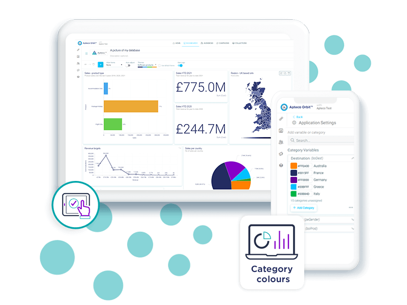
Colour is a fantastic way of storytelling with your data. Another new feature in Orbit is category colours, which allows you to set specific colours for brands, products, regions or any other selector category you like, providing consistency and helping with instant recognition to facilitate quick decision making. For example, if you were creating an election dashboard, you could choose to use colours associated with the political groups to clarify and give context, or if you were comparing how one product is performing against another, you could use brand colours to make it instantly apparent which product is being referred to.
In Orbit dashboards, we have simplified our dashboard tile UI by organising tile options within a single accessible and navigable menu, created a new 'Save as PDF' button and dashboard charts can now display a percentage above the main chart colour indicator bars.
There have also been improvements made to the map tool in FastStats. Looking at catchment areas and identifying drivetimes, for example, the distance from a store, the nearest airport, or perhaps a live event, can be a useful marketing tool. The drivetime capability in the FastStats map tool has now been extended so that you can choose to calculate drivetimes using the Bing Isochrone API. With no fixed number of endpoints, the new method can return more complex shapes and, consequently, more accurate results, often more quickly.
In PeopleStage, you can now preview and test within the delivery step of our WhatsApp integration. This function allows you to view a preview of the text in your message and to send a test to yourself.
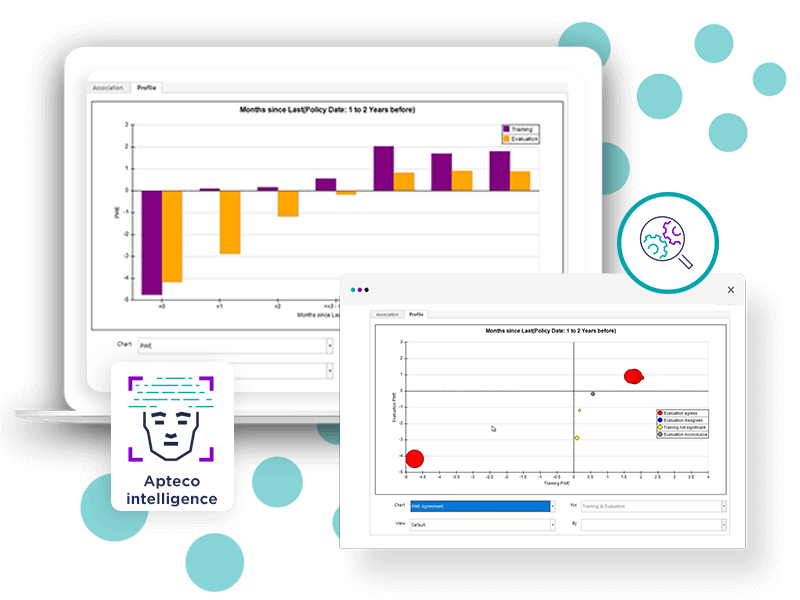
The latest developments to the behavioural modelling feature in Apteco FastStats allow you to easily identify and select the best features to use in a data model. A selection of new charts, with a combined training and evaluation option, allow you to compare training and evaluation periods simultaneously. A new metric – Uplift PWE – provides an alternative to the power metric and allows you to investigate niche features which may only apply to a small subset of your customer base, but still provide a strong indication of a good prospect.
To find out more, Apteco partners and customers can login to read the full release notes.